Friction Can Be a Feature
Contents
The case for slowing things down on purpose
Most digital design treats friction as a bug. I’ve come to think some of it is a feature. A pause before an action, a tool that makes you wait, a step you can’t skip — these are usually filed under “bad UX.” But the same delay that annoys you out of a compulsive tap is the delay that hands you back a choice. The thesis here is simple: make important work easier, and make compulsive consumption slower.
This is the other half of the idea I wrote about in my local-first media diet. That post was about choosing what reaches your attention. This one is about the texture of getting there.
What this solves
- Reframes friction as a tool, not a failure.
- Separates the kind of speed worth chasing from the kind that hurts you.
- Gives a single rule for redesigning your defaults.
The internet trained us to read waiting as a defect
Somewhere along the way, every delay became a problem to engineer away. Pages that load in under a second. One-tap checkout. Autoplay so you never decide to keep watching. Feeds that refill before you reach the bottom.
None of this is evil on its own. Fast is genuinely good for a lot of things. But the cumulative lesson is dangerous: that any wait is a flaw, and the ideal interface is one where your impulse and the outcome are separated by nothing at all.
That’s a great goal for a payment terminal. It’s a terrible goal for your attention. When there’s zero gap between wanting something and getting it, you stop noticing whether you actually wanted it.
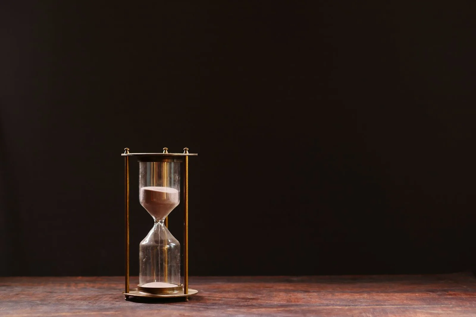
Why “five-nines” is a bad life philosophy
In infrastructure, “five-nines” means 99.999% uptime, about five minutes of downtime a year, the system is basically always available. For a bank or a hospital, that’s the right target. You want the lights on every time.
But somewhere people started applying that standard to themselves. Always reachable. Always available. Every app one tap away, every notification instant, every feed refreshed. The phone as a system with five-nines uptime on you.
Here’s the part I’m least sure how people will take: a person running at five-nines isn’t reliable, they’re cornered. Infrastructure should never be down. A life needs downtime built in. The friction that introduces small, deliberate gaps - the app that’s slightly annoying to open, the device you left in another room, is the human equivalent of scheduled maintenance.
Do slow tools actually make you more deliberate?
In my experience, yes. The clearest example is a deliberately slow browser. Something like Tor isn’t fast, and it isn’t trying to be, every request takes a noticeable beat. The first few minutes that’s irritating. Then something shifts. When each action has a visible cost, you stop opening tabs you don’t mean to open.
You don’t idly check things on a slow tool. You decide to. The friction does the deciding-whether-this-matters work that you’d normally skip.
I’m not saying everyone should browse the slow way. I’m saying the effect is worth noticing: speed removed the moment of intention, and slowness gave it back. That’s the trade hiding inside most “improvements” to convenience.
Short-form feeds are the opposite move
Short-form video is the purest example of friction engineered to zero. There’s no decision between clips. No loading. No natural end. The next thing is already playing before you’ve finished the last.
Strip out every gap and you get something that goes down like digital fast food: easy, engineered, gone in seconds, and somehow you’re still hungry. Not because the content is worthless, but because nothing in the design ever asks you to choose. The feed chooses, and you ride along.
The fix isn’t willpower. It’s reintroducing the gaps the design removed. A library instead of a feed. A video you downloaded on purpose instead of one served to you. A phone that behaves like a tool instead of a slot machine.
The rule: ease the work, slow the compulsion
So here’s the whole idea in one line. Make the things that matter frictionless, and put friction in front of the things that don’t.
That’s the asymmetry worth designing for. Writing should be one tap away; the feed should be three. Calling a friend should be effortless; opening the app you doom-scroll should cost a small, deliberate annoyance. The point isn’t to suffer. It’s to spend your default path of least resistance on the stuff you’d actually endorse later.
Concretely, that’s looked like a few things for me. Physical books on the nightstand, easy to reach. Videos downloaded ahead of time instead of browsed live. Notifications mostly off, so attention is pulled by me and not by a server somewhere. None of it is dramatic. It’s just moving the friction to where it does some good.
The honest doubt
I’ll name the weak part of my own argument. Friction can absolutely become its own kind of theater, a way to feel virtuous about being inconvenient without changing anything real. A slower tool you never use isn’t deliberate, it’s just abandoned. And some friction is genuinely just bad design, with no hidden upside to find.
So this isn’t “all friction is good.” It’s narrower than that. The useful question is: what is this delay protecting me from, and do I want to be protected from it? When the answer is a compulsion I’d rather not feed, the friction earns its place. When it’s just in the way, cut it.
What reaches your attention shapes your life. Sometimes the best way to protect it is to make a few things a little harder to do. If you’ve found friction that quietly improved a habit of yours, I’d like to hear what it was.